



As a molecular modeler, you’ve likely encountered a challenge that feels all too familiar: interpreting noisy, scattered data from your simulations or analyses. Whether you’re dealing with distance measurements, energy calculations, or RMSD distributions, the raw data often presents itself as an overwhelming array of numbers—a jagged, hard-to-interpret skyline. But what if there was a way to transform this noisy data into an elegant, smooth representation that highlights the most relevant trends?
Enter the Density Curve tool in SAMSON’s Path Analyzer. This processing feature is designed specifically to help you derive clear signals from noisy scalar analyses, turning jagged histogram-like distributions into smooth, insightful visualizations. Here’s how it works and why it matters.
Why Use Density Curves?
Imagine you’ve saved a scalar analysis in SAMSON—perhaps a set of energy values over time or a distribution of distances. At first glance, plotting a histogram might seem like the best way to visualize this data. However, histograms depend heavily on binning: their appearance changes drastically based on how you set bin sizes. Too few bins? The data looks overly smoothed. Too many? The resulting plot becomes jagged and noisy, obscuring meaningful trends.
A density curve overcomes these issues. Using a Gaussian kernel density estimation (KDE), it generates a smooth, probabilistic representation of your data. You get a clear landscape, not a jagged skyline, of your distribution—a landscape that highlights preferred states and meaningful population trends without guesswork.
Creating a Density Curve in SAMSON
Adding a density curve to your analysis in SAMSON is straightforward:
- Open the Path Analyzer.
- Create or select an existing scalar analysis in the Analysis Tray (e.g., Distance, Energy, or RMSD).
- In the Observable menu, select Density Curve.
- Ensure one scalar analysis is selected from the Analysis Tray.
- Click Add Density Curve. Voilà, your data is transformed into a smooth, interpretable curve.
Key Insights From Density Curves
But what does this smooth visualization actually tell you?
- Easier Trend Identification: Unlike histograms, density curves summarize populations of data without being overly dependent on bin size. Preferential states, peaks, and valleys become more apparent and interpretable.
- No Frame Linkage: These are aggregate representations of value distributions, not tied to specific frames, meaning they help you focus on overarching trends rather than isolated moments.
- Precursor to Advanced Analysis: Density curves often serve as the foundation for more complex visualizations, such as 2D density maps and energy landscapes. Use them to understand your data before diving deeper.
See It in Action
An example speaks a thousand words. Below is an image of the Path Analyzer’s Density Curve tool in action:
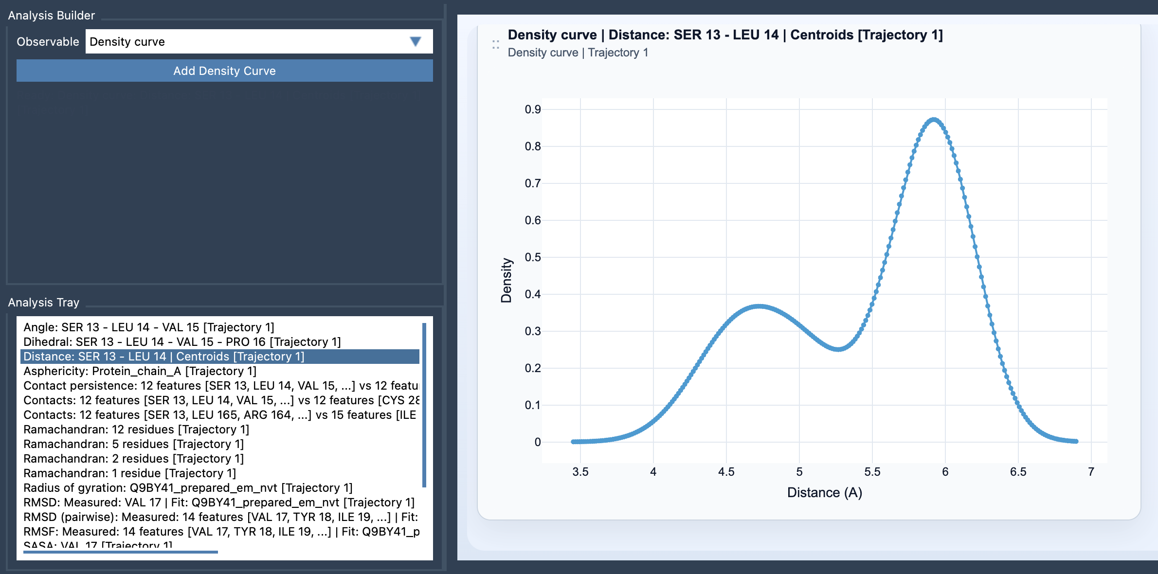
Notice how the jaggedness of the data disappears, replaced with a smooth curve that clearly indicates key points of interest. With density curves, you can identify energy minima, structural preferences, or any other trends specific to your data set.
Closing Thoughts
If you frequently find yourself overwhelmed by the granularity or noise in your molecular data, density curves provide a valuable solution. By summarizing data into smooth, interpretable landscapes, they empower you to quickly spot trends and pinpoint areas worth deeper investigation.
For further details on using this powerful tool, visit the full documentation page: Density Curve Documentation.
SAMSON and all SAMSON Extensions are free for non-commercial use. Get it today at SAMSON Connect.