



Analyzing molecular pathways often involves dealing with large volumes of scalar data, and identifying hidden patterns or relationships can be overwhelming. The Custom Scatter plot feature in SAMSON offers a straightforward and efficient way to uncover correlations, anticorrelations, clusters, or transitions between two user-defined scalar analyses.
Why Custom Scatter Plots?
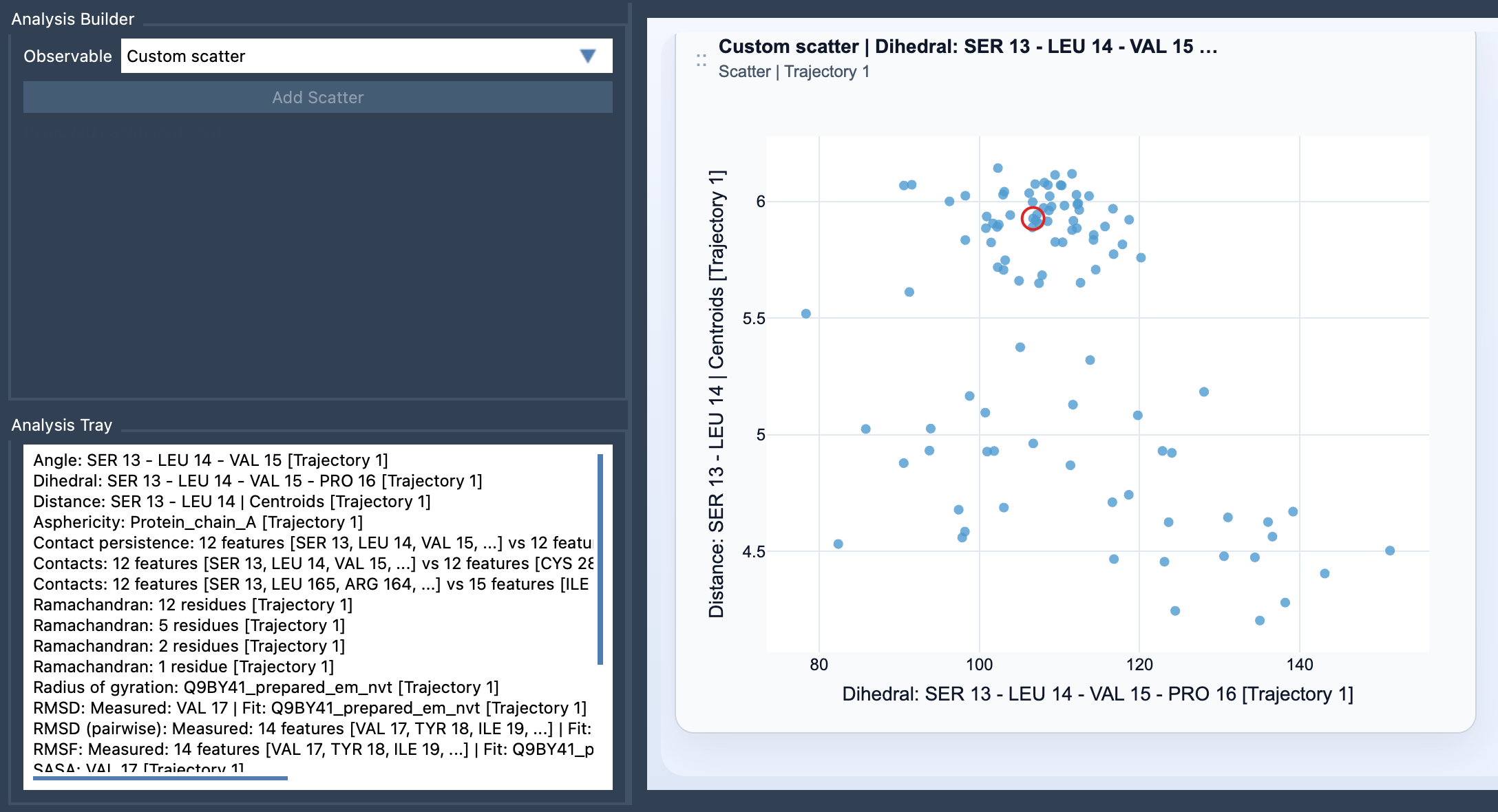
Imagine you’re exploring the relationship between energetic and structural properties of a pathway, such as Distance vs Energy or RMSD vs Radius of gyration. Instead of manually combing through data, a scatter plot gives you an immediate, intuitive visual representation of these relationships. Whether it’s revealing clusters or identifying significant transitions, scatter plots act as a powerful tool to make sense of complex molecular data.
Getting Started with Custom Scatter
To create a Custom Scatter plot in SAMSON, follow these steps:
- Open the Path Analyzer module.
- Create or reuse two scalar analyses from the Analysis Tray.
- Select Custom Scatter under Observable.
- Choose exactly two scalar analyses from the tray.
- Click Add Scatter to generate your plot.
Key Inputs and Features
The Custom Scatter is classified as a derived analysis, meaning it relies on scalar data stored in the Analysis Tray, rather than direct atom selections. This distinction allows for versatility and reuse of precomputed results.
- Both source analyses must be scalar values—for example, RMSD, Energy, or Radius of Gyration.
- If the scalar analyses are frame-linked (derived from the same pathway), the scatter plot can dynamically follow the current frame, allowing real-time interaction.
Interacting with the Plot
One of the highlights of the Custom Scatter plot is its interactive functionality. For frame-linked analyses, clicking a point on the scatter plot can automatically move the pathway to the corresponding frame in your data. This makes it easier to pinpoint where key events or transitions occur along your molecular pathway.
Pro Tips
Here are some tips to make the most of your scatter plots:
- Focus on pairs of analyses that answer a specific scientific question, such as Distance vs Energy or SASA vs Radius of Gyration.
- Scatter plots are often a good starting point for creating more advanced visualizations like 2D density maps or energy landscapes. Begin with scatter plots to get a clear view of the general trends, and then proceed to density maps for deeper insights.
Further Exploration
To dive into the full potential of Custom Scatter plots and see additional examples, you can visit the full documentation page at this link.
Note: SAMSON and all SAMSON Extensions are free for non-commercial use. You can download SAMSON at SAMSON Connect.