



As a molecular modeler, identifying correlations or patterns in your simulation data can be challenging. What if you could quickly compare two sets of scalar analyses and uncover clusters, correlations, or transition pathways in an intuitive and visual way? The Custom Scatter plot feature in SAMSON's Path Analyzer offers exactly that.
What is the Custom Scatter Tool?
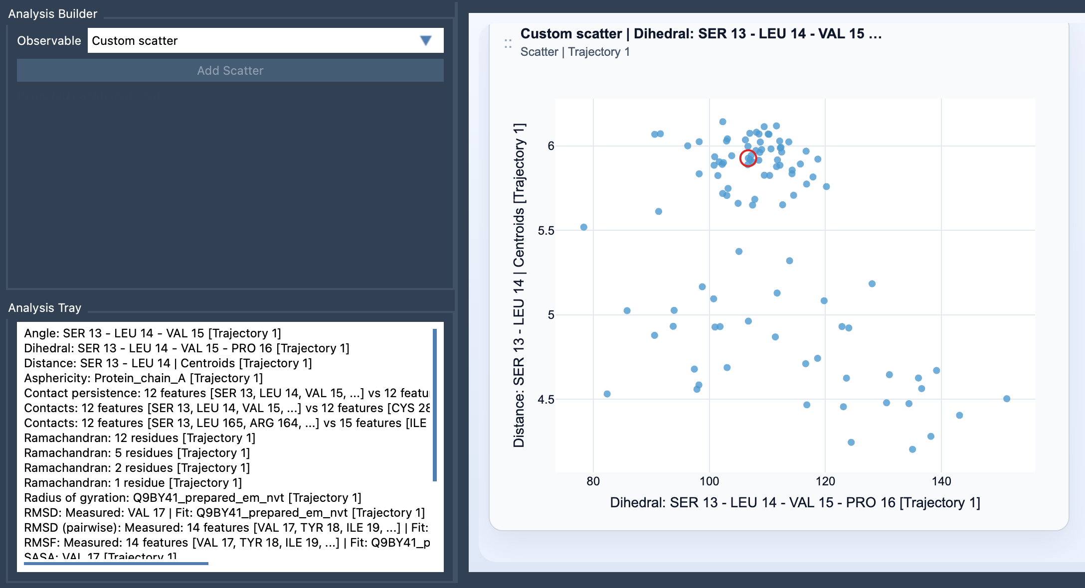
The Custom Scatter feature allows users to plot two saved scalar analyses against each other, producing a scatter plot where each point represents a sampled pair of scalar values. This analysis is particularly useful for investigating relationships like energy vs distance, RMSD vs radius of gyration, or SASA vs distance. It's an efficient way to glean insights from your data and uncover hidden trends or clusters in a user-defined observable space.
How to Add a Custom Scatter Plot
Creating a Custom Scatter plot is straightforward:
- Open the Path Analyzer.
- Save or reuse two scalar analyses in the Analysis Tray.
- Select the Custom scatter option under the Observable menu.
- Choose precisely two scalar analyses from the tray.
- Click Add Scatter to generate the plot.
In no time, you'll have a visual representation of your data's relationships, ready for exploration and interpretation.
Interactive Features and Insights
The Custom Scatter isn't just a visualization tool; it's also interactive. When the two source scalar analyses are frame-linked (e.g., derived from the same molecular path), clicking a point on the scatter plot can move the molecular path simulation to the corresponding frame. This feature makes it easier to investigate the context of individual data points and validate your hypotheses.
Use Cases to Get You Started
Here are some scenarios where Custom Scatter plots can save time and enhance your analysis:
- Energy vs Distance: Observe how energy changes as a function of atomic displacement or reaction progress.
- RMSD vs Radius of Gyration: Identify distinct conformational clusters in your molecular system.
- SASA vs Distance: Analyze solvent-accessible surface area variations during molecular binding or unfolding.
Custom Scatter plots are often the perfect starting point for deeper analysis, such as creating a 2D density map or plotting an Energy landscape.
Tips to Maximize Insights
To make the most out of the Custom Scatter feature, ensure your scalar analyses address a well-defined scientific question. For example, don't just arbitrarily pair observables; instead, focus on combinations that might reveal meaningful trends related to your research goal. This focused approach minimizes noise and emphasizes significant patterns in the data.
Custom Scatter plots in SAMSON offer a highly visual and intuitive way to dive deep into molecular relationships and spot answers to key research questions. This tool is an excellent complement to other advanced analyses like density maps or free energy landscapes, giving you the power to explore your system from multiple perspectives.
To learn more, visit the official documentation: Custom Scatter Documentation.
SAMSON and all SAMSON Extensions are free for non-commercial use. Get your free copy of SAMSON today at https://www.samson-connect.net.