



A molecular trajectory can produce a long list of measurements: distances, energies, RMSD, radius of gyration, solvent-accessible surface area, and more. The challenge is not collecting values—it is figuring out how two observables relate as the structure changes. Does a distance tend to increase as the energy changes? Do conformations with similar RMSD also have similar compactness? A table can make those relationships hard to see.
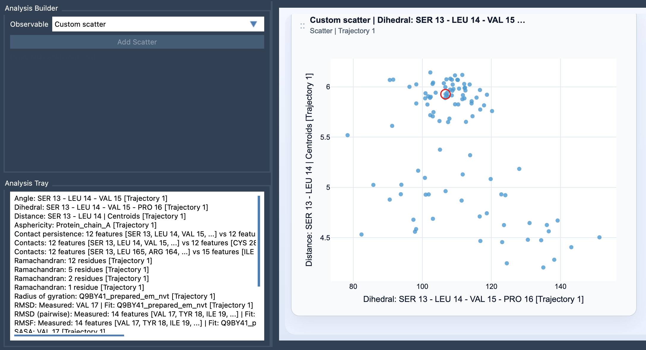
A scatter plot offers a direct way to compare two saved scalar analyses. Each point represents one sampled pair of values, placing one observable against the other. Instead of inspecting two separate curves and trying to mentally line them up, you can look for patterns in the paired measurements.
Start with a question, not just two measurements
The most useful scatter plots begin with a specific question about your system. For example:
- Distance vs Energy: Does a change in a chosen distance tend to accompany a change in energy?
- RMSD vs Radius of gyration: Are structures that differ more from a reference also more expanded or compact?
- SASA vs Distance: Does the solvent-accessible surface area vary alongside a particular distance?
These comparisons do not establish cause and effect. They help you see whether two measurements vary together, move in opposite directions, form groups, or follow a more complicated pattern. The scientific interpretation still depends on what the observables measure and how the trajectory was generated.
Build the comparison in Path Analyzer
Custom Scatter is a derived analysis: rather than working directly from atom selections, it uses saved scalar analyses in the Analysis Tray. Open Path Analyzer, create or reuse two scalar analyses, choose Custom scatter under Observable, and select exactly two saved scalar analyses in the tray. Then click Add Scatter.
That “exactly two” requirement is a useful prompt to keep the plot focused. Before adding it, check that both saved analyses represent the quantities you intend to compare. If an analysis does not answer your question, choosing a more relevant scalar may produce a more interpretable plot.
Read the shape before drawing conclusions
A compact, sloping cloud of points can suggest that the two observables tend to vary together or in opposite directions. Separated groups may point to distinct sets of sampled values, while a curved or diffuse pattern can indicate that the relationship is not captured by a simple straight-line trend. These are visual clues, not conclusions by themselves: consider the molecular context, the range of sampled structures, and whether the analyses are comparable across the path.
Also remember that a scatter plot shows paired values, not the order in which they occurred. If you need to investigate how a pattern relates to particular frames, frame linkage can help. When both source analyses come from the same path and remain frame-linked, the scatter plot can stay connected to the current frame; clicking a point can move the path to its corresponding frame. This makes it easier to inspect a point in the context of the structure it represents.
Use the plot as a first step
A scatter plot is often a practical first look before making a more detailed view. If the points suggest regions of interest or non-uniform sampling, a 2D density map may help you examine how values are distributed. To explore energy in relation to the path, consider an Energy landscape. Start with the pair that best expresses your question, inspect the pattern, and then decide whether a further analysis is warranted.
For setup details, see the Custom Scatter documentation.
Note: SAMSON and all SAMSON Extensions are free for non-commercial use. Get SAMSON.