


When running umbrella sampling simulations in molecular modeling, one key concern is ensuring sufficient sampling across the entire reaction coordinate space. Without even coverage, results from Potential of Mean Force (PMF) calculations may be misleading or incomplete. This is where the histogram graph generated by the WHAM Analysis tab in the GROMACS Wizard becomes particularly useful.
Let’s walk through how this visualization helps detect potential oversights and how it fits into a broader PMF analysis workflow.
Understanding Gaps in Reaction Coordinate Coverage
When you compute PMF using the Weighted Histogram Analysis Method (WHAM), you get two main outputs: the PMF profile and a histogram. The histogram indicates how well sampling was performed across the reaction coordinate. Spikes suggest heavy sampling in specific regions, while valleys or empty bins could indicate under-sampled or unvisited regions.
This becomes critical when interpreting PMF plots. Even if a PMF curve appears smooth, insufficient data in a region could introduce artifacts.
The Role of Histogram Visuals in GROMACS Wizard
Once your umbrella sampling simulations are complete and organized into folders based on reaction coordinates, GROMACS Wizard automatically compiles the data. All you have to do is:
- Go to the WHAM Analysis tab
- Choose the project path or use the auto-fill feature
- Select a reaction coordinate from the list
- Click Compute
This computation produces two plots side by side: the PMF and the histogram.
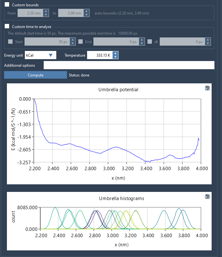
The histogram plot immediately shows whether some regions of the reaction coordinate are less represented. For instance, if your histogram shows dense sampling between 1.0–2.5 Å and a dip between 2.5–3.0 Å, this suggests that umbrella windows in the latter region either weren’t run or didn’t produce enough useful data.
Planning Additional Computations
This information allows modelers to pinpoint exactly which additional windows might be needed. Rather than redoing the entire simulation, you can selectively expand sampling only where it matters. This targeted approach saves both time and computational resources.
Also, once you’ve run extra simulations to cover missing regions and updated your project folder (e.g., by adding new subfolders), you can rerun the WHAM computation. GROMACS Wizard uses cached results when possible but will incorporate new data when available. It also organizes everything in the wham_results subfolder.
Summary
Learning to interpret histogram plots is a valuable skill for any molecular modeler working with umbrella sampling. The histogram enables data-driven decisions and prevents interpreting PMF results that are potentially biased. GROMACS Wizard in SAMSON simplifies this analysis by visualizing the histogram alongside your PMF, helping you refine your workflow step by step.
To learn more, visit the complete documentation: https://documentation.samson-connect.net/tutorials/gromacs-wizard/pmf-analysis/
SAMSON and all SAMSON Extensions are free for non-commercial use. You can get SAMSON at https://www.samson-connect.net.