



For molecular modelers analyzing complex datasets, spotting correlations or clusters in your observations can be a game-changer. If you’ve ever faced the challenge of combing through extensive analyses, SAMSON’s Custom scatter tool might just be your next best friend. This blog post dives into using the Custom Scatter feature for insightful visualization and analysis.
Why Use Custom Scatter Plots?
When analyzing molecular trajectories, you often want to explore relationships between two different scalar properties. Maybe you’re asking questions like: “Does distance have a clear relationship with energy?” or “What’s the connection between RMSD and the radius of gyration?” The Custom Scatter plot tool in SAMSON provides a direct way to compare two saved scalar analyses to uncover correlations, anti-correlations, clusters, or even transition pathways in user-defined observable spaces. This visual approach can save hours of confusion, helping establish meaningful scientific insights.
Getting Started
Adding a scatter plot is an intuitive process that fits seamlessly into existing workflows. Even if you’re new to SAMSON, you’ll find the steps straightforward:
- Open Path Analyzer in SAMSON.
- Create or reuse two scalar analyses and add them to the Analysis Tray.
- Under Observable, choose Custom scatter.
- Select the two scalar analyses from your tray.
- Click Add Scatter, and voilà! Your Custom Scatter plot is ready.
Key Features and Inputs
The Custom Scatter feature is designed to be powerful yet flexible. Here are some things to note:
- It’s a derived analysis, meaning it uses your Analysis Tray instead of direct atom selections.
- You’ll need two scalar analyses as inputs, which can be easily created or sourced from your existing workflow.
- If both analyses originate from the same path and are frame-linked, the scatter plot remains dynamically connected to the current frame. This means clicking data points on the scatter plot can automatically take you to corresponding frames along a molecular path, allowing for deeper exploration.
Visualizing the Scatter
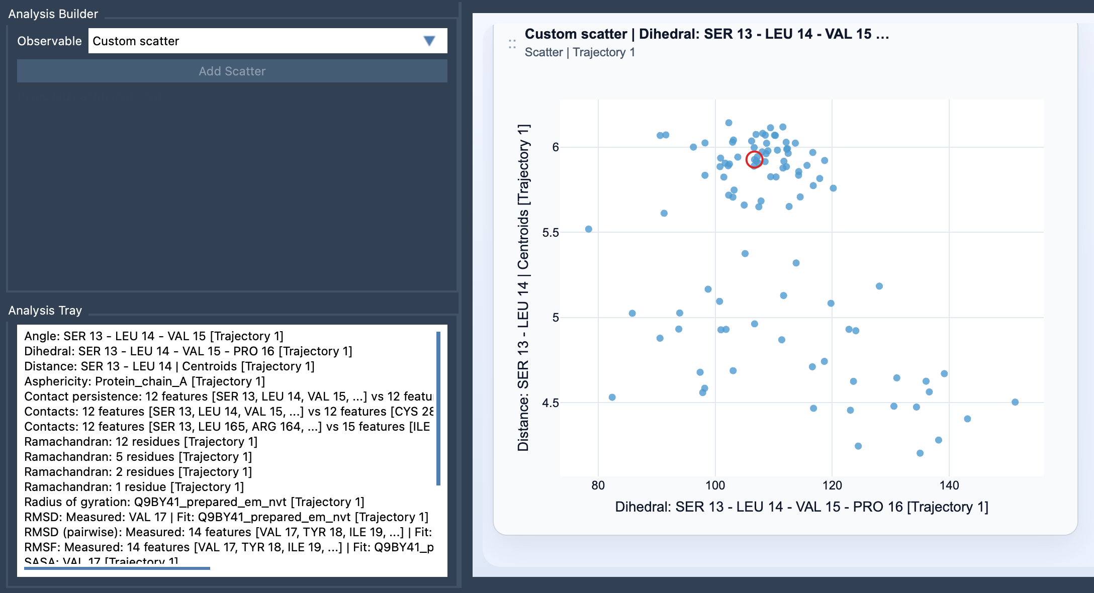
Your scatter plot provides a high-level overview, with each point representing one sampled pair of scalar values. The graph offers immediate insights into the relationships between the selected properties, making it an efficient launchpad for more detailed studies. For example, you might use it as a precursor to creating a 2D density map or an Energy landscape.
Interactivity: Make Science Dynamic
What makes this tool particularly exciting is its interactivity. When working with frame-linked analyses, clicking a data point on the scatter plot allows you to move directly to the corresponding frame in your molecular trajectory. This interactive feature makes it easy to analyze specific regions of your dataset in detail, bridging the gap between numerical and visual data interpretation.
Tips for Effective Scatter Plot Use
To maximize your use of Custom Scatter, here are a few tips:
- Choose meaningful metric pairs. For instance, comparing Distance vs Energy, RMSD vs Radius of gyration, or SASA vs Distance often yields scientifically pertinent insights.
- Use Custom Scatter plots as a first step. They can guide the decision to perform more advanced visualizations like density maps or energy landscapes.
Next Steps
The Custom Scatter feature unlocks valuable exploratory capabilities for molecular modelers. Ready to dive deeper? Check out the full documentation here: https://documentation.samson-connect.net/users/latest/references/path-analyzer/custom-scatter/.
SAMSON and all SAMSON Extensions are free for non-commercial use. Curious? Get SAMSON today from https://www.samson-connect.net.