



A long molecular trajectory can produce thousands of measurements: distances, RMSD values, energies, or radii of gyration. Looking at the raw values—or at a histogram with awkward bin choices—can make it hard to see where the system spends time or which ranges appear repeatedly. A density curve offers a smoother view of the distribution, helping you spot patterns without treating every small fluctuation as a separate feature.
In SAMSON’s Path Analyzer, a Density curve is a derived analysis built from one saved scalar analysis. Instead of selecting atoms directly for this plot, you choose the scalar series already stored in the Analysis Tray. The result is a smooth estimate of how the sampled values are distributed.
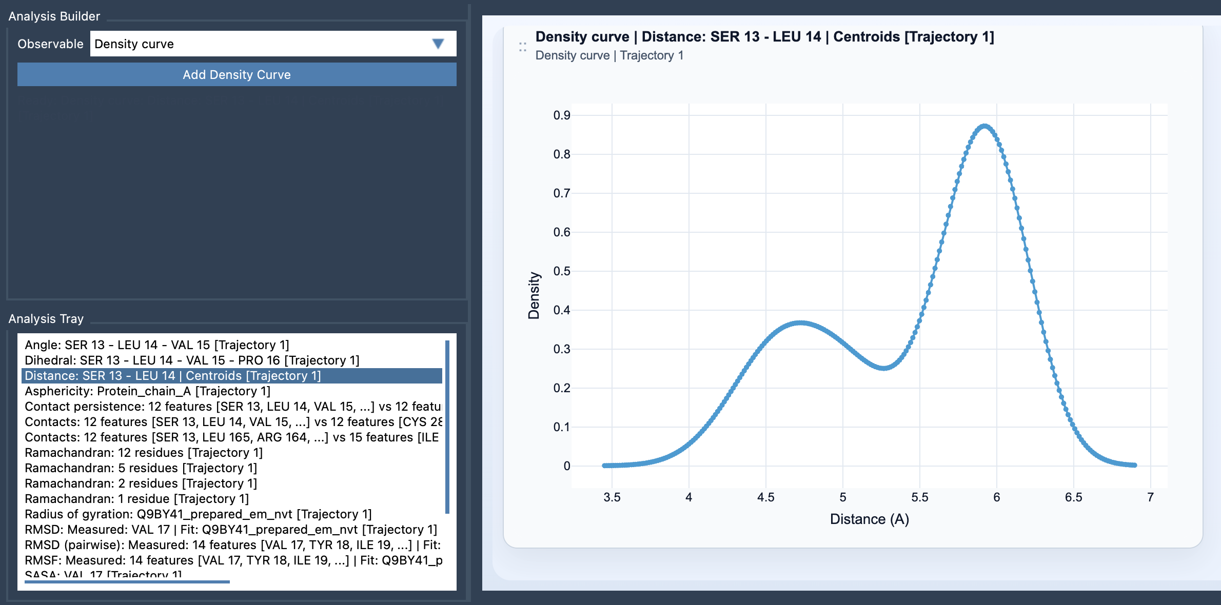
What the curve represents
Imagine each measured value as a small contribution spread around its location on the horizontal axis. The method uses Gaussian kernels to smooth those contributions, then combines them into one curve. In simplified terms, the estimate at a value x is the average influence of all samples, with a smoothing width called the bandwidth. Path Analyzer chooses this bandwidth automatically.
A higher region of the curve indicates a range where sampled values are more concentrated. Several peaks can suggest that the measurements cluster around more than one range. A broad peak indicates a more spread-out distribution than a narrow one. These are clues about the population of observed values—not proof, by themselves, of distinct conformational states or their physical significance.
When it helps
Consider a distance analysis that fluctuates during a simulation. A histogram may look jagged, and its appearance can change when you adjust the bins. A density curve provides a smoother summary of the same scalar values, making clusters and broad trends easier to inspect. The same approach can be useful for RMSD, energy, or radius of gyration when your immediate question is: “Which value ranges occur more often in this dataset?”
That question is different from asking when a value occurred. A density curve summarizes the population of values; it is not linked to individual frames. If you need to connect a feature to a particular moment in a trajectory, use a frame-oriented view alongside this distribution summary. The curve can show that a range is common, but it does not tell you the order in which the system visited the ranges.
Build one in Path Analyzer
- Open Path Analyzer.
- Create or reuse a saved scalar analysis and check that it appears in the Analysis Tray.
- Choose Density curve under Observable.
- Select exactly one saved scalar analysis in the tray.
- Click Add Density Curve.
Before interpreting the result, be clear about the source quantity and its units. A curve for RMSD answers a different scientific question from one for energy, even though both are scalar distributions. Also keep in mind that smoothing is a visualization and estimation choice: the automatically selected bandwidth affects how much nearby samples blend together. Use the curve to reveal broad distribution patterns, then return to the underlying analysis and molecular context to assess what those patterns mean.
Density curves can also be a useful first step before exploring a 2D density map or an Energy landscape. They help you inspect one scalar distribution at a time, while those other views can add another dimension or connect values to energy.
For the complete workflow and equation, see the Density Curve documentation.
Note: SAMSON and all SAMSON Extensions are free for non-commercial use. Get SAMSON.