



A molecular trajectory can contain thousands of frames, but a long list of coordinates does not always make its behavior easy to understand. A modeler may want to know whether a molecule repeatedly visits certain combinations of properties—for example, whether a particular distance tends to occur alongside a particular RMSD. Looking at either property alone can hide that relationship.
SAMSON’s Path Analyzer 2D density map helps answer this kind of question by combining two saved scalar analyses into one view. It shows how the sampled frames are distributed across a two-observable space. The key is to read it as a map of where the path’s observations accumulate, not as a map of which states have the lowest energy.
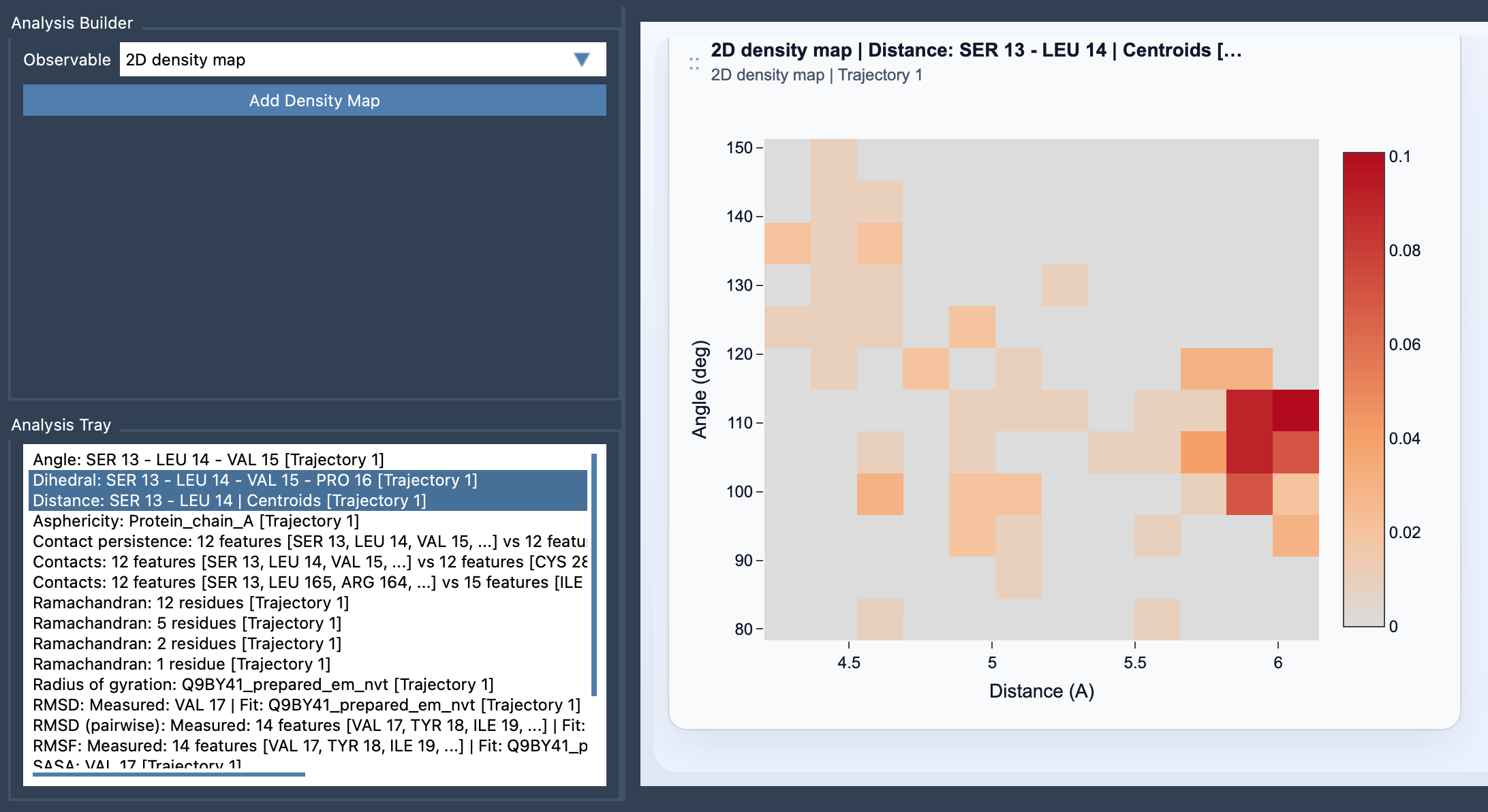
What the map tells you
Imagine plotting one scalar observable on the horizontal axis and another on the vertical axis. Each frame contributes a point at the pair of values measured for that frame. The map groups those points into bins. Regions with more points appear denser; sparse regions contain fewer sampled observations.
This view is useful when you are trying to distinguish a commonly sampled combination from one that appears only occasionally. For instance, a distance measurement by itself might cover a broad range, and RMSD might also vary broadly. Their joint density can reveal whether particular distance and RMSD values tend to occur together—or whether the observations are spread across many combinations.
How the normalization works
For a bin indexed by (m,n), let nmn be the number of sampled points in that bin, N the total number of sampled frame-wise points, and Δx and Δy the bin widths along the two axes. The displayed normalized bin density is:
ρmn = nmn / (N · Δx · Δy)
In practical terms, the count in a bin is scaled by the total number of points and by the bin’s area. This makes the value a density over the two-dimensional observable space, rather than simply a raw count. It is still a summary of the sampled data: it does not, by itself, explain why a region is populated or establish that it is energetically favorable.
Set it up with compatible analyses
- Open Path Analyzer.
- Create or reuse two saved scalar analyses in the Analysis Tray.
- Choose 2D density map under Observable.
- Select exactly two saved scalar analyses, then click Add Density Map.
There are two important compatibility requirements: both source analyses must be frame-wise scalar analyses, and they must have been computed on the same path. The density map is a derived analysis, so it uses the Analysis Tray rather than direct atom selections. If the results seem unexpected, check that the two analyses represent the intended observables and refer to the same path before interpreting the plot.
Choose observables that answer a question
A useful pair should capture complementary aspects of the motion. Distance versus RMSD can help compare a local geometric change with overall structural deviation. Radius of gyration versus energy can place a measure of compactness alongside an energy observable. These are examples, not universal best choices: select quantities that address the specific behavior you want to investigate.
Finally, keep the interpretation precise. A dense region means the sampled path contains many observations there, relative to the plotted two-observable space. It does not mean that the region has low energy. If your goal is to examine the same two-observable projection with energy as the coloring quantity, use the Energy landscape instead. For details on the workflow and equation, see the 2D density map documentation.
Note: SAMSON and all SAMSON Extensions are free for non-commercial use. Get SAMSON.