


Molecular modeling often involves working with noisy datasets—scattered, uneven distributions that can make it challenging to extract meaningful trends. Whether you’re analyzing energy variations, distances, or structural properties, addressing such noise is critical to making sense of molecular landscapes. This is where density curves come into play, transforming unruly data into clear, interpretable insights.
What is a Density Curve?
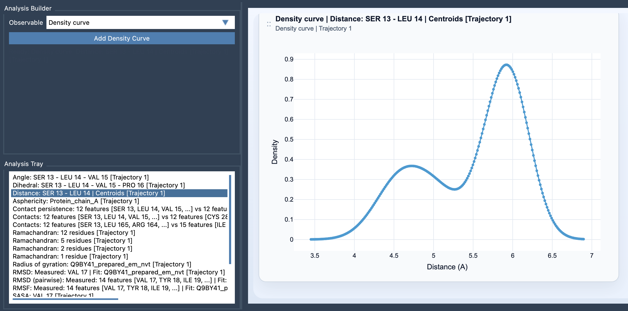
In molecular analysis, a density curve is a smooth, one-dimensional estimate of the distribution of a scalar value. Imagine transitioning from a histogram’s blocky representation of data to a fluid curve that captures the essence of preferred states without the jaggedness of binning. The Density curve feature in SAMSON’s Path Analyzer offers just that: a simple yet effective way to visualize trends in noisy datasets.
The density curve leverages a Gaussian kernel density estimate, which smooths data points to create a continuous representation of the distribution. This makes it especially useful when interpreting datasets like bond distances, energies, or radii of gyration, allowing you to identify populations or states with ease.
Why Use Density Curves?
Here are some of the key advantages:
- Improved readability: Unlike histograms, which can be sensitive to bin size, a density curve presents data as a smooth trajectory. This makes it easier to identify peaks and trends.
- Sensitivity independent of frame-linking: Since density curves summarize value populations, they are not dependent on specific frames or snapshot selections in your simulation.
- Preparation for advanced analysis: These curves are excellent precursors to building 2D density maps or exploring an energy landscape.
How to Create a Density Curve in SAMSON?
Creating a density curve in SAMSON is simple and involves just a few steps:
- Open the Path Analyzer.
- Either create or reuse a saved scalar analysis from the Analysis Tray, such as Distance, Energy, or RMSD.
- In the Observable dropdown menu, select Density curve.
- Choose a single saved scalar analysis from the tray.
- Click Add Density Curve, and voilà — your smooth density plot is ready!
Here’s an example of what a density curve looks like:
Best Practices for Using Density Curves
To make the most out of density curves, consider these tips:
- Replace jagged histograms: If traditional histograms look too irregular or sensitive to bin size in your analyses, density curves are a better, smoother alternative.
- Focus on interpretability: The curves highlight trends and preferred states, making them highly suitable for summarizing value distributions efficiently.
- Use alongside advanced tools: Transition easily from density curves to building more complex visualizations like energy landscapes or multidimensional density maps.
With tools like the density curve in SAMSON’s Path Analyzer, the process of refining noisy datasets and identifying key molecular trends becomes seamless and intuitive. Whether you are analyzing structural dynamics, energetics, or any other scalar property, this feature can save time and unlock new insights.
To explore more details or dive deeper into the feature, check out the official documentation page.
Note: SAMSON and all SAMSON Extensions are free for non-commercial use. You can download SAMSON at SAMSON Connect.